
Top Ten Tuesday is a weekly feature hosted by The Broke and the Bookish. This week’s very fun theme is ‘Ten book cover trends I like/dislike’. I’ve decided to split my list in half; five I like and five I don’t.
Five cover trends I like
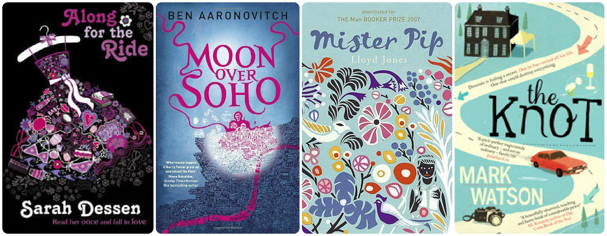 1. Nice illustrations rather than photos/literal drawings. As you can see from my Top Ten Tuesday list of book covers I’d frame as art, I much prefer illustrations or graphic design on covers, they are just so much more eye-catching and impactful than photos and I think they show that the designer has put much more thought into how best to represent the book on its cover.
 2. Title integrated into the cover design. I really like it when the designer has taken the time to think of clever ways to incorporate the title into the illustrative design of the cover, rather than just superimposing it on top of an image in a boring font.
 3. Fuzzy, soft covers. This is tactile rather than visual, but I really like the increasing trend for British paperback book covers to be made from soft rather than shiny cardboard. I love to read physical books and these covers which are pleasant to touch make them even more joyful to read. These also tend to have the type of illustrated covers which I prefer.
 4. Arty re-releases of classic books. Classic books are so widely available that publishers have to make a real effort to make beautiful versions of these books to make you want to buy them.

5. Dramatic black and white (and red) covers. This slightly contradicts my moan about Twilight inspired black and red covers below, but when this concept is used cleverly and originally it can be really stunning.
Five cover trends I dislike
 1. Full faces on the cover. I like to be able to imagine the characters for myself and it’s really jarring when your imagination doesn’t match the picture on the cover. On Simon Mayo’s Radio 2 book club they have a theory that a book is literary fiction if you can’t see the full face and popular fiction if you can, so I suppose if a book features a face it usually indicates it’s lower quality, but I don’t think that always applies.
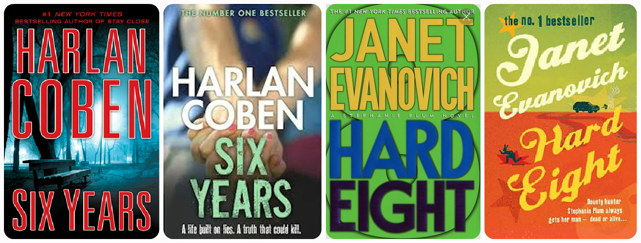 2. Big shouty writing. I really dislike covers which are mostly taken up by big writing, this applies most often to crime fiction, and is particularly prevalent on American versions of the covers. See the examples above comparing a couple crime books’ British editions (right) with their American counterparts (left).
 3. Naked body parts – particularly bare chests on American romance covers. These covers are so unsubtle, I can’t imagine who would be happy buying a book which looked like this! British romance book covers could not be more different, they are all pastel colours, cakes, shoes and flowers.
As you can tell from items 2 and 3 on this list, I’m fascinated by how different British and American covers are.
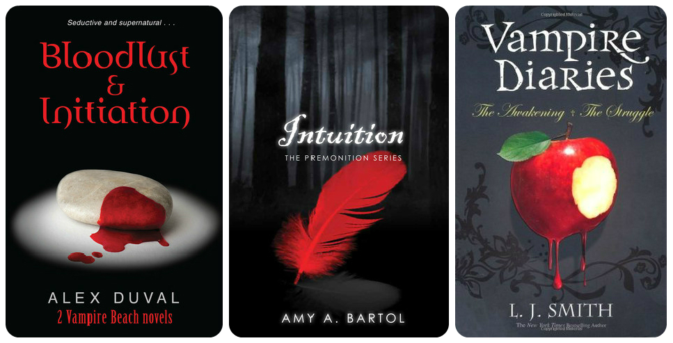 4. Twilight inspired supernatural YA fiction covers. For a while it seemed like about 75% of YA fiction in bookshops was some ugly rip-off of Twilight – black backgrounds, red images. They’re all so samey, it’s impossible to judge their quality. More recently I’m getting annoyed by how many awful looking Fifty Shades of Grey inspired covers have started appearing everywhere.
 5. Boring stock photography images which don’t help you understand what the book will be about. We went to see Rosie Thomas give a talk at our local bookshop a couple of months ago and when she was asked whether she likes her books’ covers, she basically said they were awful!
Which cover trends do you like? Do you prefer British or American style covers?

Oh, the Twilight knock-off covers!! Urgh. Especially the edition of Wuthering Heights featuring a white flower and a red ribbon and the tag line ‘Edward and Bella’s favourite book’. I suppose it got teens reading classics but the cover makes me cringe. And I definitely agree on the body parts too! Great list!
I know, I almost included the Wuthering Heights cover in my list but it’s not really YA fiction, even though they’re packaging it that way.
Great list! I especially dislike the full faces covers. They irritate me so much!
Great post. Esp re the SHOUTY writing – also changing the font sizes between the author/title depending on what the publisher marketing wants to emphasize. Or what about the horrid made-as-a-movie covers of great classics? I could go on and on… but it’s good when you know what might be for you just by glancing at the cover — i.e. your dislike list :).
I love illustrated covers and when the title is integrated with the design!
Great post! Here’s my TTT
Ugh that Twilight classics line makes me rage. It made me rage four years ago and it makes me rage now.
I agree that there’s something fantastic about the focus of graphic design in covers vs. putting manipulated images of “real” people in. I actually don’t have as much problem with the Twilight-inspired covers, so long as the symbol on the cover actually says something about the story itself (which, sadly, most of them don’t).
Great picks! I dislike half naked men (and women) on book covers as well. It kind of sets a precedence that what you’re reading is something pornographic. Lol. Thanks for visiting!
Fabulous post. I don’t like it when other books rip off other popular covers. It’s so irritating.
I LOVE all of your likes! 😉 I really love when covers integrate the title so beautifully! And I would totally rather have a simple illustration than just a stock photo, too!
Thanks for stoppin’ by! Have a great week!
Thanks!
This is a great list. I also really don’t like the shouty book covers! Why? Just Why? Really.
Lynn 😀
Ooooh I also am a super fan of arty classic releases and graphic black & white & red. And shouty covers are terrible! Great list!
Thanks!
Great timing for me for this theme! I’m starting the design process for a cover for my novel and it helps to read all these other opinions.
I totally agree with you,especially on the naked body parts and the twilight inspired covers!! 😮
I love #4! It’s so much fun seeing the re-releases of classic books, what a great choice!
While I do appreciate full-face covers being a starting point for imagining the cover, I totally understand your views on wanting to conjure up your ideal protagonists. It’s also disappointing when how they’re described is completely different than what’s displayed on the cover.
Cheers,
joey via. thoughts and afterthoughts
I agree with pretty much everything on both your lists! I’d like to add my own dislike: covers that try too hard too portray that this is a “deep and insightful book”, when it’s usually just a cheesy cliche. Typically something like a ray of sunlight on an old bridge in a forest, an autumn leaf in a pond, or something like that.
I know what you mean.
Oh I like this post! Gives me an idea for my next blog post. Anyway I live in a conservative country so I’m always embarrassed to carry books with half-naked covers. 😉